OverView
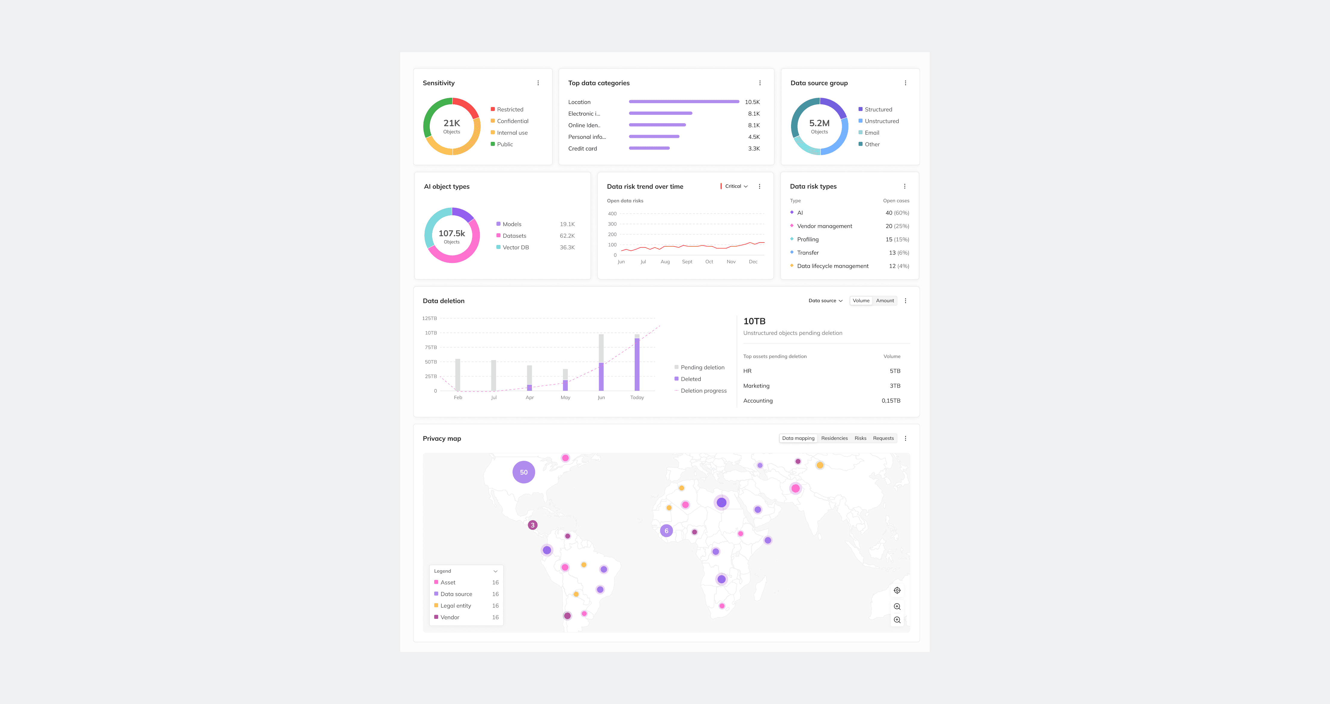
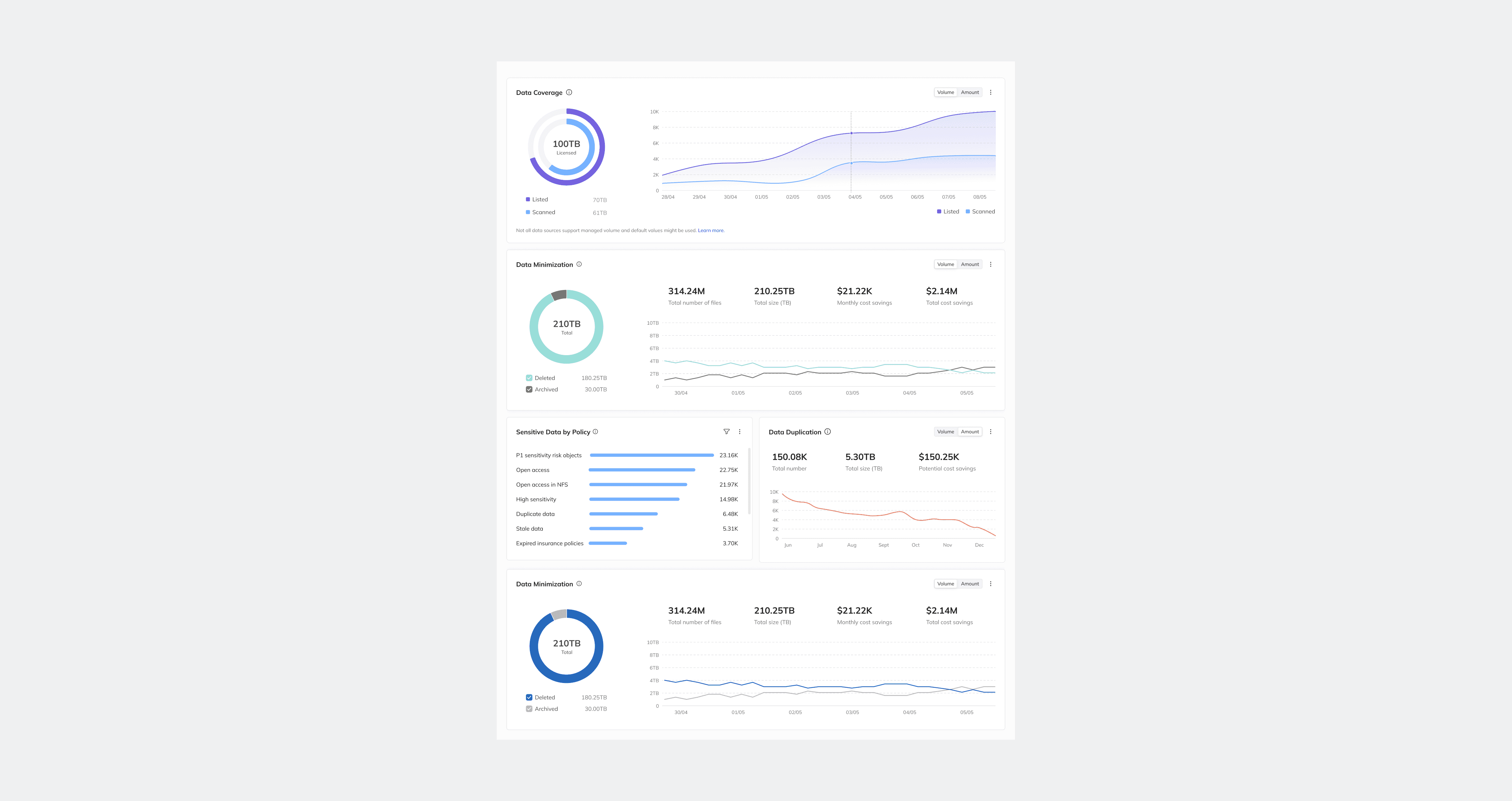
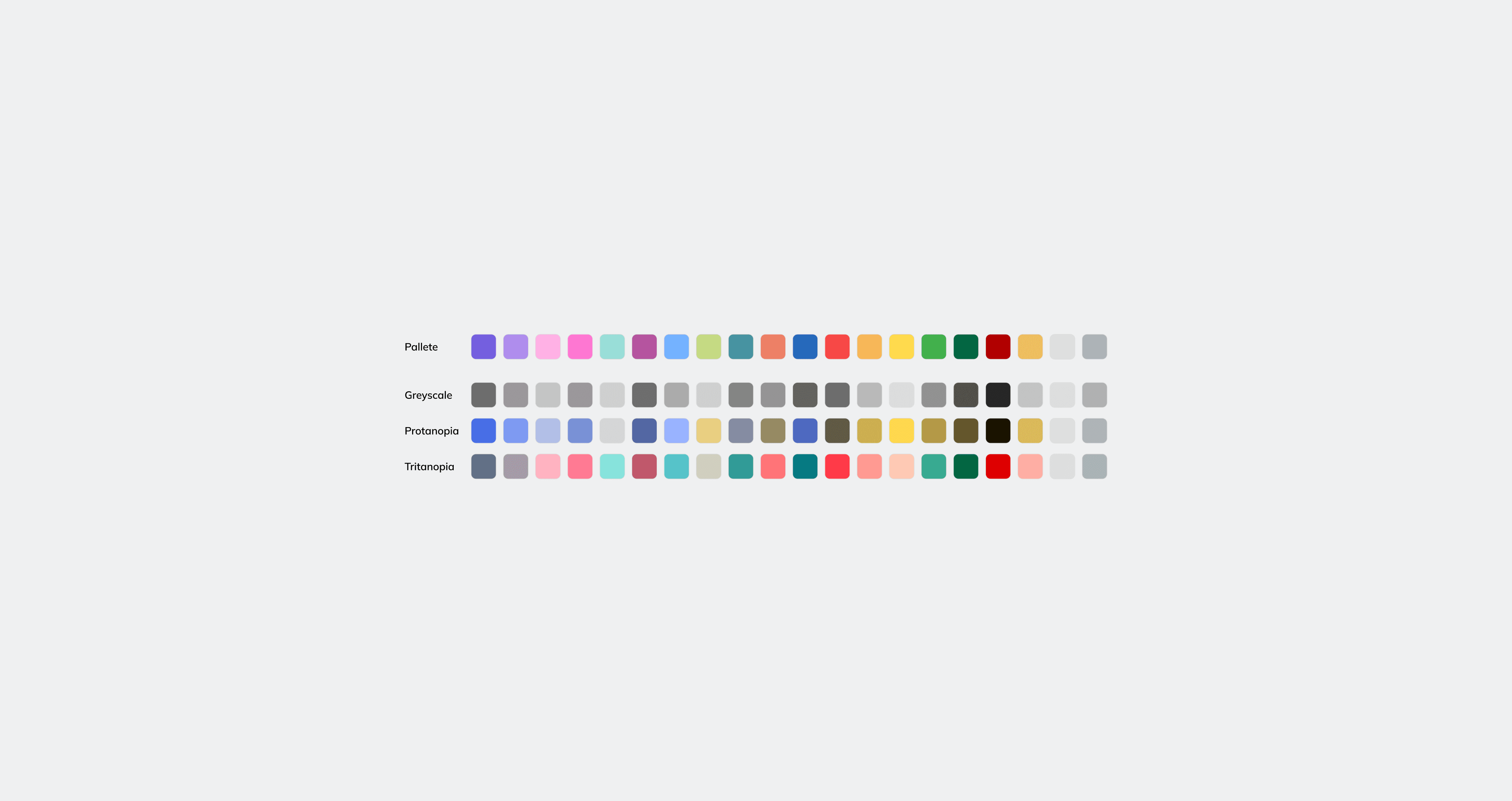
Working within BigID’s design system involved maintaining and evolving a large-scale component ecosystem used across complex enterprise workflows. As the platform continued to grow, data visualizations became increasingly inconsistent across products, dashboards, and use cases. Different teams approached chart colors differently, creating challenges around readability, semantic clarity, accessibility, and visual hierarchy.
One of the main constraints throughout the project was working within an already established and widely recognized product color system. Rather than introducing an entirely new visual language, the challenge became designing a scalable framework that could preserve existing brand associations while improving consistency and usability across complex data experiences.
What initially appeared to be a visual problem quickly revealed itself as a systems problem. Different chart types required different visual behaviors, varying numbers of data points demanded different levels of distinction, and surrounding dashboard environments continuously affected readability and contrast.
Building the Framework
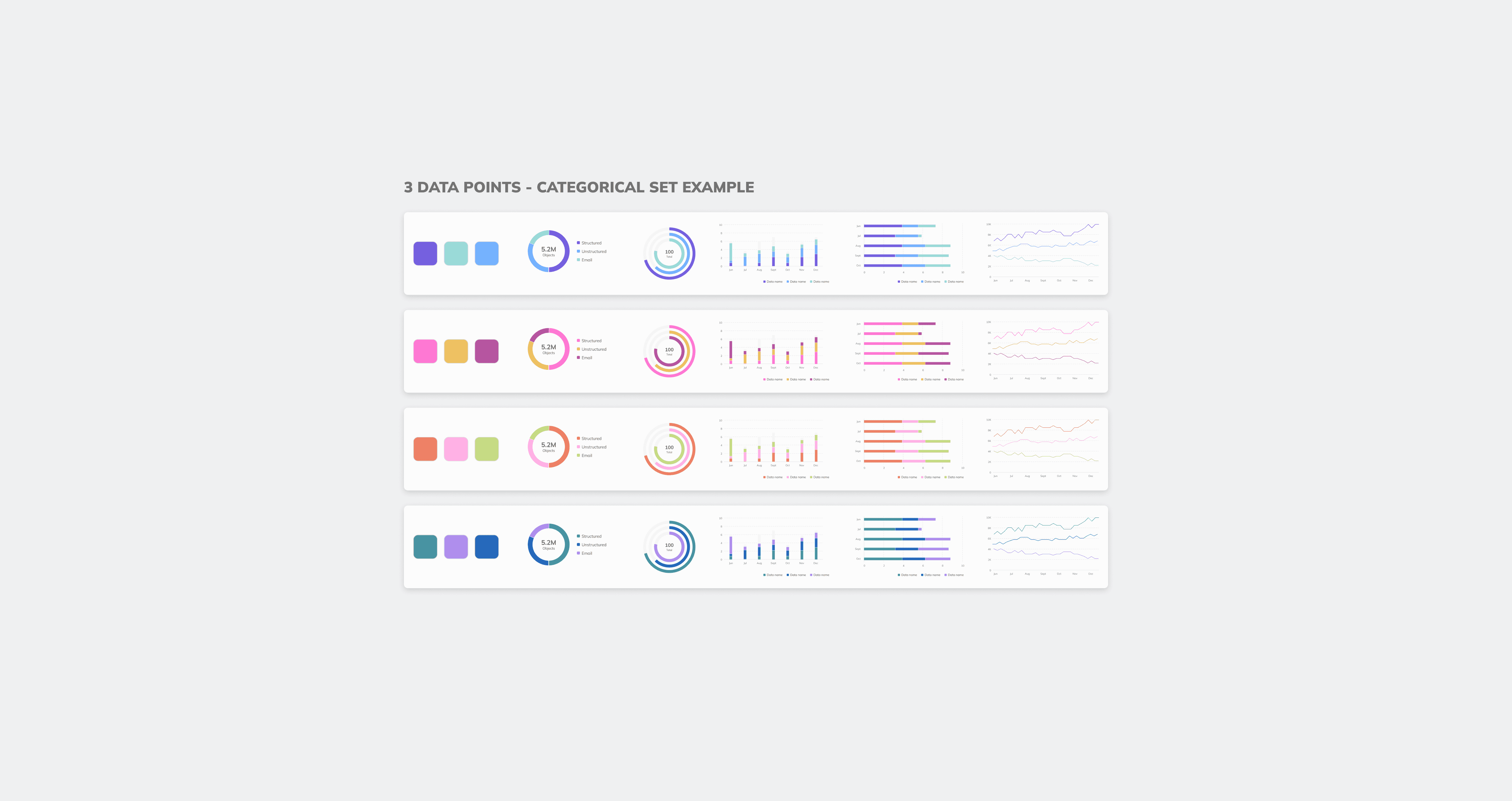
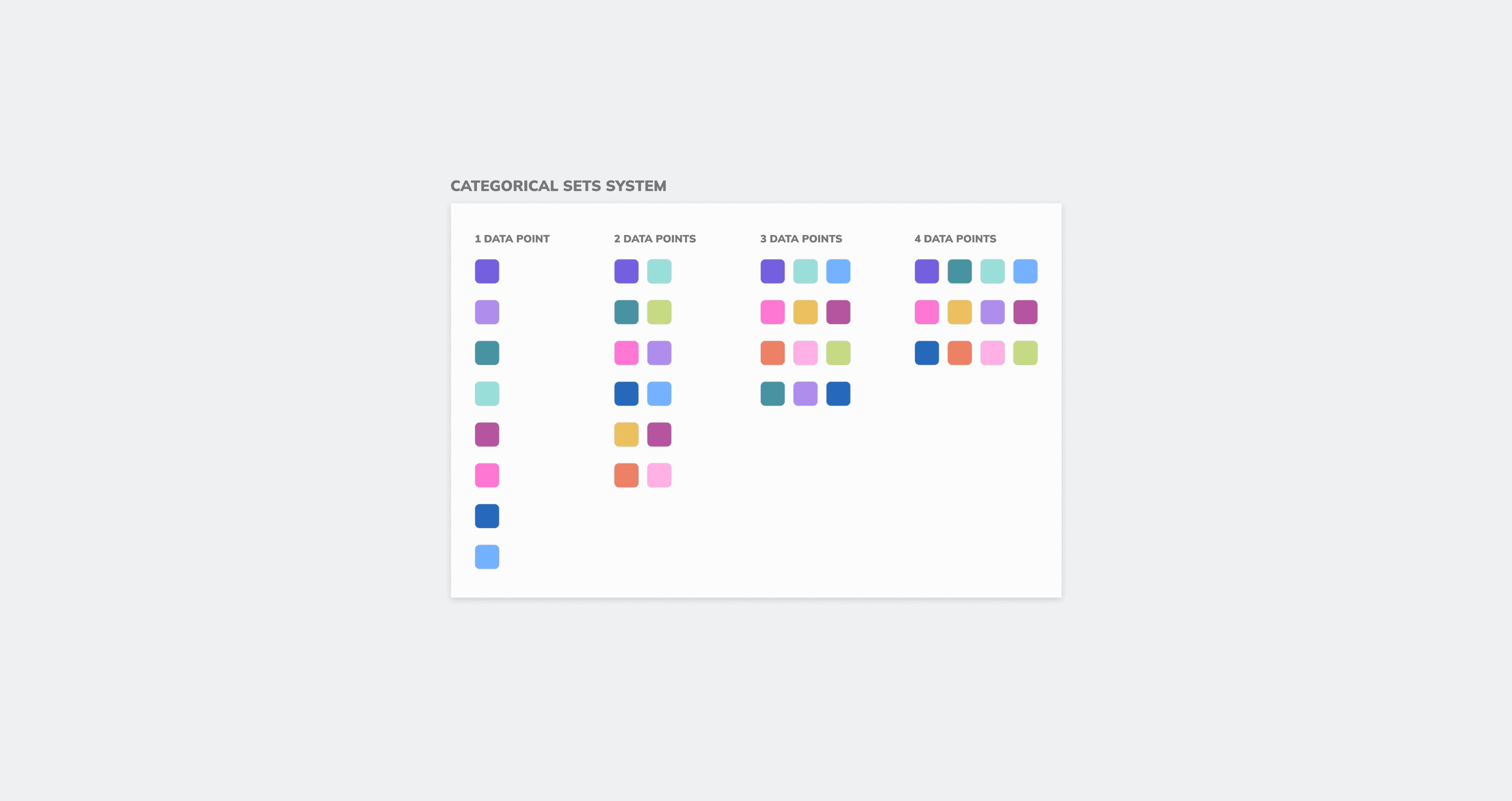
The project evolved into the design of a structured visualization framework that could guide designers through complex chart-color decisions in a scalable and repeatable way. Instead of relying on subjective color selection, the system introduced predefined logic based on the type of data being visualized, the selected chart type, and the number of data points within the dataset.
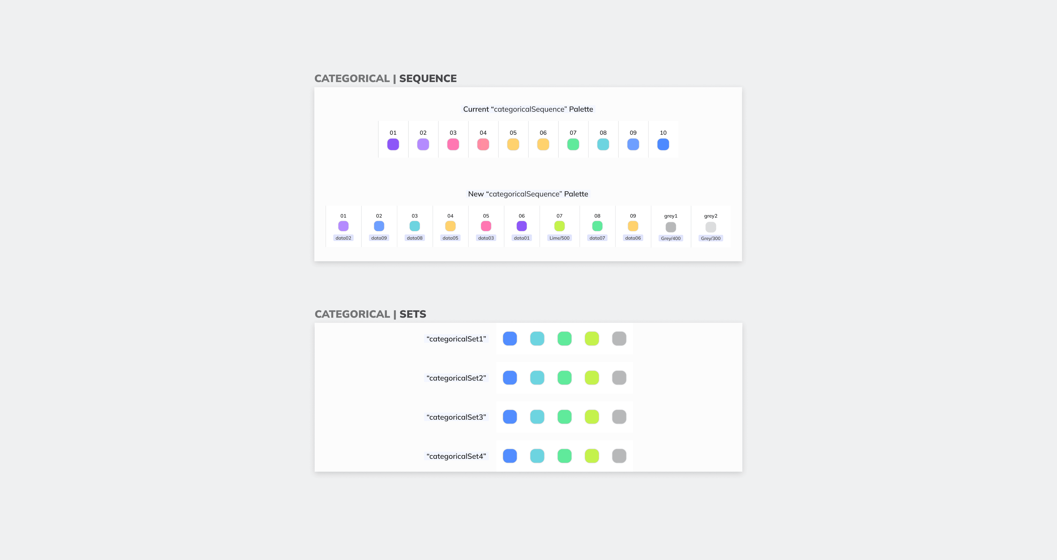
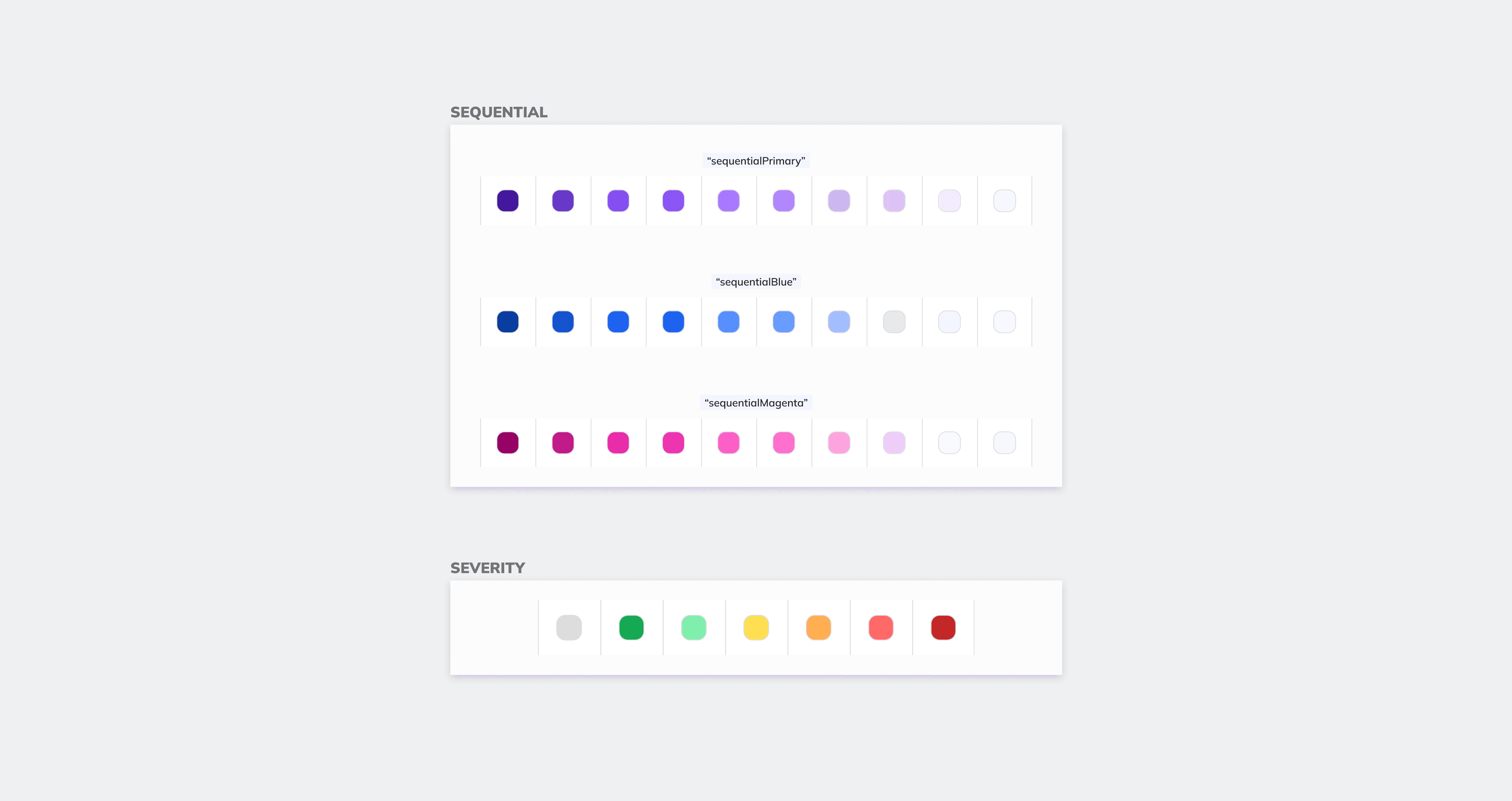
Extensive testing and iteration focused on balancing accessibility, differentiation, semantic meaning, and compatibility with BigID’s existing visual language. Categorical datasets required carefully ordered color sequences to maximize distinction between adjacent data points, while sequential and severity-based datasets introduced their own unique behavioral and hierarchical requirements.
The final system included predefined 1–6 data point color sets, dedicated frameworks for categorical, sequential, and severity visualizations, and clear guidance around which combinations should be used across specific chart types and dashboard contexts. Rather than functioning as a static palette, the system became a decision-making framework that helped designers navigate complex visualization scenarios with greater consistency and confidence.
Impact
Beyond the visual redesign itself, the project focused on turning the framework into scalable infrastructure that could support long-term adoption across the organization. The visualization system was implemented directly into Figma assets and documentation, allowing designers to work within a shared and standardized workflow rather than rebuilding visualization logic from scratch for every new dashboard or product surface.
The system reduced ambiguity around chart construction, simplified visualization decisions across teams, and created stronger alignment between design and implementation. By approaching data visualization as an evolving system rather than a collection of isolated charts, the project helped establish a more cohesive and scalable visual language for enterprise data experiences.
More than a color update, the work explored how thoughtful constraints, structured decision-making, and accessible visual logic can transform complex data into clearer and more consistent product experiences at scale.